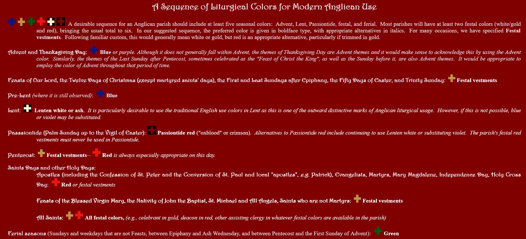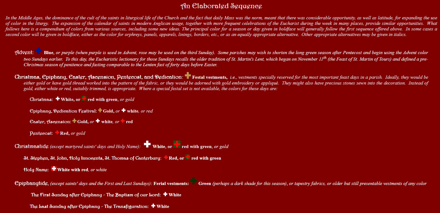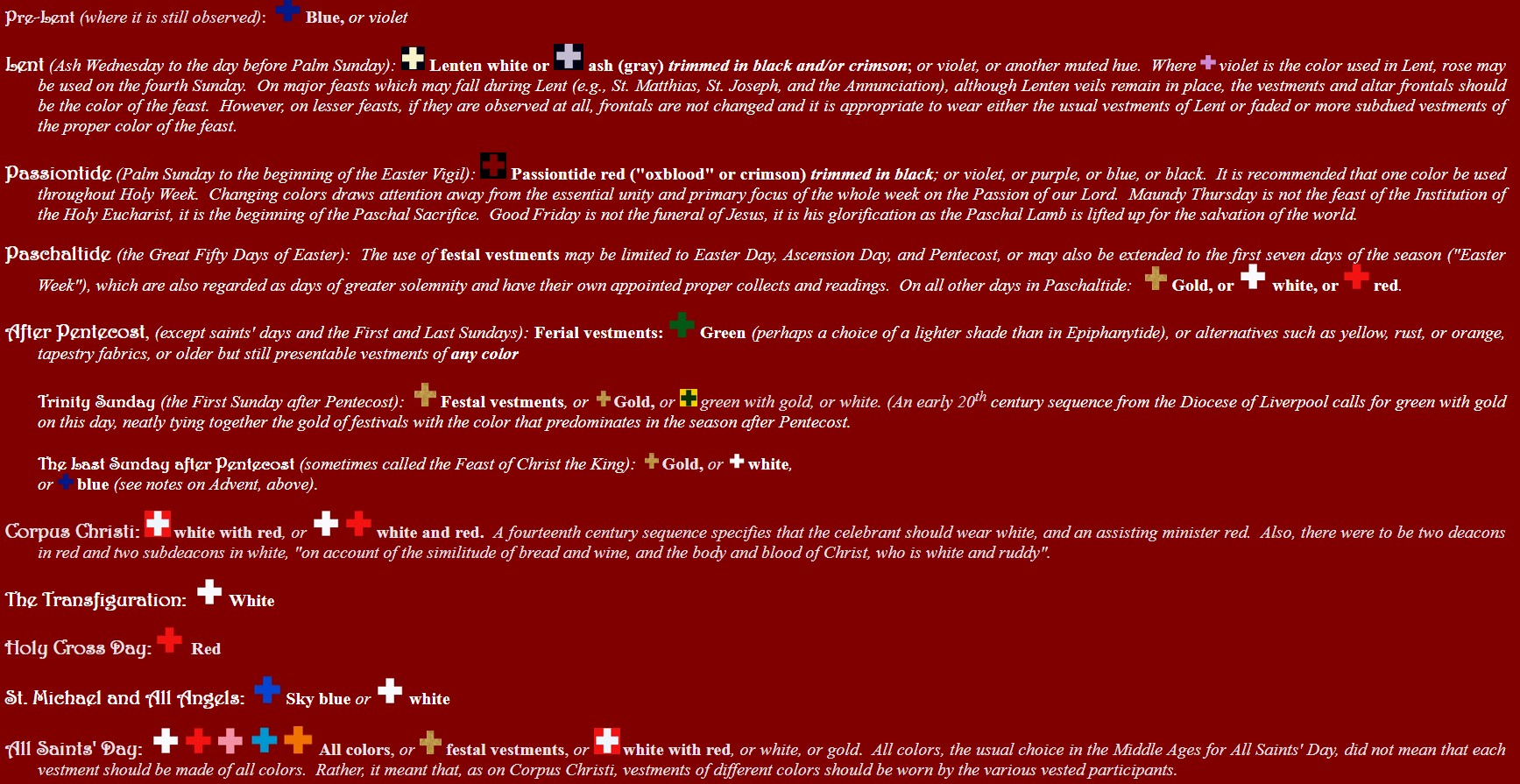
As the Church moves through the year, it provides many symbols to remind us of the significance of seasons and days. Color can be highly expressive and reflective of mood and meaning and colored vestments and hangings have been among the most prominent symbols used in many churches. However, as Percy Dearmer pointed out a good many years ago in his classic book, The Parson's Handbook, there is a great deal of misunderstanding, and sometimes even a misinformed dogmatism, about particular colors and color sequences. The aim of this article is to provide information about the history and meaning of the liturgical spectrum, particularly in Anglican use, and to encourage a practical and also creative approach to the use of color in divine service.
At the present time, the most commonly found color sequence is that used by much of the Roman Catholic Church, with white, red, green, and violet as the principal colors. For many years, this sequence has been the dominant one, not only in the Roman Church, but in other Western churches. There is substantial value in such a standardized scheme. It is easily "read" by ordinary worshipers when moving to a new parish or when visiting other churches. It helps to establish a setting for worship that supports a common sense of meaning and does not distract from the central action.
However, the modern Roman use is just one sequence and, in recent years, many churches in the Anglican Communion have revived other color schemes or portions of them, particularly variations on the sequences used in various English cathedrals and dioceses in the Middle Ages. In some cases, the purpose has been to establish a more distinct Anglican identity. In other cases, the purpose has been to renew and enrich the setting of worship and thus to freshen and enhance the worship itself.
It should be clear that we certainly do not disparage the color sequence of the Roman use. It is, in fact, similar to the use of various English cathedrals in the fourteenth century. Furthermore, in small parishes with limited resources, a simple, standard color scheme is the best option and the familiarity and ready availability of the vestments in the colors of the modern Roman use recommend it. On the other hand, those same limited resources may mean that some flexibility in the use of color really could be useful. For example, what is to be done when the parish's only green chasuble finally gives up the ghost but there are no funds to replace it? Would it really be a crime to substitute the parish's rarely used red vestment, which is probably in near-mint condition because it has previously been reserved for Pentecost and a handful of feasts of apostles and martyrs?
At the other end of the scale, is it really necessary, if greater resources are available, to limit the possible choices to a narrowly defined color sequence? Undoubtedly, there are clergy and laypeople who would welcome a change from the seemingly endless procession of green Sundays. They might occasionally wish that the green chasuble would wear out, or at least that some agreeable alternative might be found. In the Middle Ages, when the cult of the saints dominated the liturgical calendar, this was not an issue. It is sometimes mistakenly thought that green was not used at all in medieval English churches. Inventories of vestments contradict this error. However, it is true that green was not used nearly as much then, due to the fact that the feast of a saint so frequently took precedence over the ferial mass.
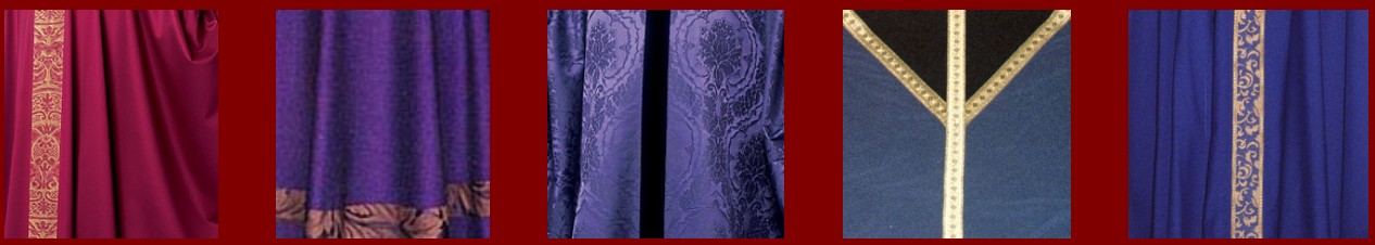
In any case, the medieval church took a much more fluid approach to the business of liturgical colors. The principles inherent in medieval color sequences were not always governed by particular symbolic characteristics that a color might be thought to represent. For example, red, the color reserved for feasts of the Holy Spirit and martyrs in the modern Roman use, was the usual color in many medieval English churches for the Sundays between Pentecost and Advent, not the green which has become so familiar in modern use. Although there were variations from place to place, the oldest known English uses consisted of just three principal colors: white, red, and blue or black. White was the festal color; either blue or black was the color for Advent and Lent; and red was the color for ferial seasons. As the notion of fixed color sequences began to spread, a variety of other colors were introduced. By the 16th century, inventories of vestments listed as many as seven colors which were commonly used, and there were actually more since certain colors (e.g., green and yellow) were regarded as interchangeable.
In most places, it was the quality of the vestment, rather than the color, that was most important. In some cases, no color at all is specified. Instead, for certain feasts the rule simply calls for the finest vestments the church owned. In theory, at least, this could have meant that if the best vestments happened to be black they would be used on Christmas and Easter. Conversely, the oldest and most worn vestments were to be used on days of minor importance, meaning that even cloth-of-gold might be worn on a midsummer weekday of no particular liturgical significance, if the condition of the vestment was relatively faded and worn.

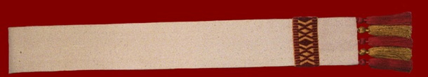
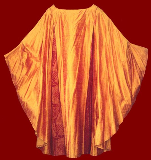
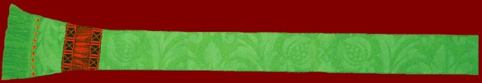
In fact, this principle is still implicit today. The stoles to the left of this text both belong to sets of vestments that would be regarded as "festal". This would probably be obvious with regard to the white damask stole on the left with its blue and gold damask orphrey and gold tassels. However, the primary material of the right-hand stole is a shade of white that, in the traditional English use, might be regarded as more Lenten than festal. Nevertheless, setting aside the obvious fact that the colors of the orphrey and tassels are festal, the determining factor in the use of this stole is the fact that the material is raw silk--rough-textured, to be sure, but still too fine a material for the penitential season of Lent.
In secular dress, there are similar conventions regarding color. For example, in our culture black is generally preferred to express sorrow and mourning. On the other hand, black is also regarded as particularly elegant on formal occasions of great festivity when a man's outfit would consist of a black tuxedo and a woman might opt for a fashionable black dress. In reality, the quality of the fabric and its ornamentation, and also the style or cut of the garment, are at least as important as the color, perhaps more so. And there is no reason why this may not be so with liturgical vesture, as well.
Our survey of the liturgical spectrum is organized around the seasons and special days of the Church calendar. Traditional color sequences and their symbolic significance are presented here, together with ideas and suggestions for alternatives. We have foraged in sacristies, private collections of vestments, and in vestment catalogues (especially the catalogue of our friends at the Holy Rood Guild) for illustrations and will add more examples in the future as we find them.


Purple is the traditional color of royalty and is the more familiar color for the season of Advent, the season in which we look forward to the coming of the King. As a season of preparation, Advent is, in some ways, penitential. However, penitence is only one of the themes of Advent. The primary emphasis is on the character of the One who is coming, the royal Judge who comes to take his throne, and that emphasis governs the liturgical symbolism of the season. Thus, Advent purple should be a rich hue (either red purple or blue purple, but fully saturated in either case), proclaiming the royal lineage of the coming Messiah.

Blue was the color often appointed for Advent in medieval and also in later English use. And it is becoming increasingly popular as the distinctive color of Advent in churches which wish to highlight their Anglican identity. In the Middle Ages, blue, purple, and even black were generally regarded as interchangeable, and when blue itself was specified it was often identified as indigo, a deep hue, not a pale one, symbolically suggestive, perhaps, of the darkness of night in which the world sleeps, before the dawn of the Sun of Righteousness.

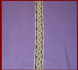
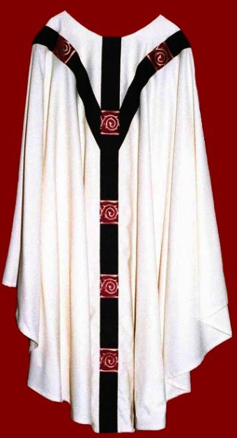
Violet is the color of Lent in the standard Roman usage. When purple is the color used in Advent, it is desirable, if possible, to use a different, paler shade for Lent, tending towards gray. Advent and Lenten vestments can also be distinguished by the colors used in orphreys and bandings, and by any symbols that might be applied to the vestments. On the right is a detail of a violet vestment with a crown of thorns orphrey which might be preferred for Lent.
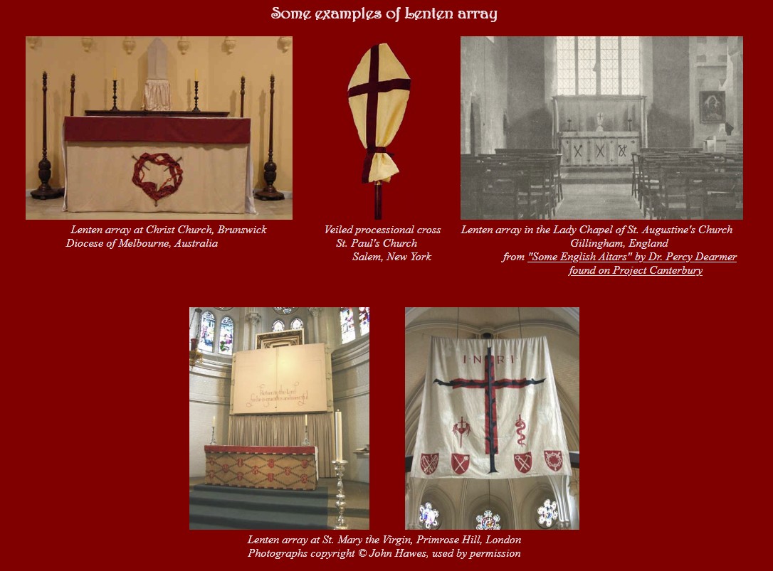
The most distinctively English color choices in the liturgical spectrum are the colors used in Lent. The traditional English "Lenten array" crossed most diocesan and parochial borders. No matter what the color scheme was for other seasons, most English cathedrals and churches quite literally "put on sackcloth", covering crosses and various decorations in the church with a coarse, more or less colorless fabric that was either painted or decorated in some other way with symbols of the Passion of our Lord. Some churches went so far as to hang a curtain in front of the altar, to veil it from the eyes of the faithful. This custom originated in ancient times when it was deemed proper to veil images of Christ as King or Victor, covering his glory during the season that focused on his suffering and death. In time, it became the custom even to veil images of the suffering Christ, for the Cross is the sign of his glory, and also to veil other statues and decorations in the church, creating a very dramatic setting for the penitential pilgrimage of the faithful through Lent.


Lenten white, a natural or off-white hue the color of unbleached linen, is the usual color of Lent in the traditional English use. Sometimes the color is identified as ash, suggesting gray, rather than white. Either is appropriate, as long as the appearance is drab and the effect somber. Absolutely plain vestments and hangings can be very effective, but the traditional Lenten array is often trimmed in black, crimson, or violet. Symbols of the Passion may be painted or sewn on the vestments and hangings. As it is the visual effect rather than any inherent quality of the colors themselves, other colors might also be considered for the Lenten array. For example, depending on the color scheme of the church building and the permanent appointments, some shades of brown, trimmed in crimson or black might also serve the purpose very well.


Oxblood, or Passiontide red, a deep red, or crimson, trimmed with black is the English use color for Passiontide (once a season that began two weeks before Easter, but now more properly limited to Holy Week, which begins on Palm Sunday, the Sunday of the Passion). This Passiontide red is distinguished from the brighter reds used for feast days. Where oxblood vestments are used to replace Lenten white, they are used throughout Holy Week, from Palm Sunday until the beginning of the Great Vigil of Easter. If oxblood vestments are not available, purple or violet may be substituted, signifying that in Holy Week the King is acclaimed by the crowd, condemned by the secular authorities, and takes his throne upon the Cross. Whereas the Roman usage calls for different colors on certain days of Holy Week, the English custom is to view the daily liturgies, and especially the liturgies of the final three days of Holy Week, the Triduum Sacrum, as a single unified liturgy simply spread over several days. This unity is demonstrated by the use of a single color throughout the week, from the Liturgy of the Palms until the beginning of the Paschal Vigil.


In the modern Roman use, Holy Week begins with red vestments for the Liturgy of the Palms. While it is desirable to use red vestments made especially for this occasion, perhaps of a dark hue similar to the English oxblood, this is not practical in many parishes, so the festal red vestments are used. Following the Palm Sunday procession, the red vestments are removed and replaced with Lenten violet, which is used through Wednesday in Holy Week. On Maundy Thursday, violet gives way to white, giving the day, at least temporarily, a festal appearance, in honor of the Institution of the Eucharist. If there is an Altar of Repose for the Watch at the Blessed Sacrament on this evening, white is the dominant color in hangings. On Good Friday, vestments are black, if the parish owns black vestments. Otherwise, they are violet.The Great Vigil of Easter may begin in violet vestments which are changed to white at the beginning of the first Mass of Easter.

While the trend in current liturgical use is to eliminate the pre-Lenten season, the Sundays known as Septuagesima, Sexagesima, and Quinquagesima, this season is not defunct everywhere. Where it is still observed, the color is violet for those following the traditional Roman use, and blue for those following the English use.

The color rose is one of the subsidiary colors of the Roman use. It is appointed for just two days of the year, the middle Sundays of Advent and Lent, when it replaces purple or violet and signifies the half-way point in these penitential seasons and a mild relaxation of the preparatory fast. The middle Sunday of Advent is called Gaudete ("Rejoice") Sunday, and the middle Sunday of Lent has a similar name Laetere (also meaning "Rejoice"), names taken from the first word of the proper Latin Introit of the day. Today, the use of rose vestments is becoming rare and is most likely to be found in Anglo-Catholic parishes that maintain the Roman color sequence.

White is actually not one color but the sum of all of the colors of the spectrum. This fact recommends it as the "color" of choice for the greatest feasts which epitomize the Faith, and it has been the most commonly appointed color for feasts of our Lord, including Christmas and Easter and the seasons following those feasts. Traditionally, white is regarded as the color of purity and joy, so it has also been the color for the feasts of many of the saints, particularly those who were not martyrs.

As with all of the liturgical colors, a variety of hues may be used when white is called for. In practice, this means that a range of colors from the purest white to cream or ivory, as well as gold or even yellow, may be used. On the most solemn "white" feasts, cloth-of-gold, or white fabric patterned with gold thread, is especially appropriate, giving a greater richness to the vestments and thus emphasizing the importance of the feast.

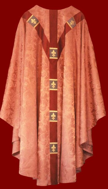
Red is a rich and highly suggestive color. Fire and blood are naturally red. Red can also signify particularly strong emotion. Passion and anger, both of which can be described as "burning" or "hot", are suggested by the color red. Bright shades of red are also very festive. Thus, red has often been used by the Church for important feast days. As a symbol of fire, red is a reminder of the tongues of fire which appeared over the heads of the apostles at the coming of the Holy Spirit on Pentecost. As a symbol of blood, red calls to mind the martyrs who shed their blood for Christ. These feasts have been the most typical uses of red, but not the only ones. In some early color sequences, red was the ferial color. On the other hand, in the East, red is often the Paschal color, and has also been used in Paschaltide in some western sequences. In the latter, although the shade of red changes, in effect the color of the Paschal mystery remains essentially the same: Passiontide red or crimson for Holy Week when the Paschal sacrifice takes place, breaking into a rich festal red on Easter when the Paschal Lamb fulfills the meaning of his sacrifice. A hint of this progression is retained in the custom of celebrating the Feast of the Holy Cross in September in festal, rather than Passiontide, red.

As noted above, in the medieval English use, one of the ruling principles was that the best vestments a church owned were to be used on major feasts, no matter what color they were. This is a principle that would seem to make a good deal of sense. It need not be taken to extremes. For example, the use of black on a major feast, no matter how rich the vestments might be, would be too great a departure from conventional expectations to be acceptable in most situations. On the other hand, too strict an adherence to that which is familiar and conventional can have the effect of robbing liturgy of its natural and appropriate drama. Furthermore, feast days, "holidays", are supposed to interrupt ordinary routines, to provide relief. But if every day is a feast day, the extraordinary soon becomes ordinary, and this means that ultimately the significance of the occasion will also be lost.
In the Middle Ages, when the cult of the saints was in full flower, virtually every day was a feast day of some sort. In that context, the festal vestments would have been in perpetual use. Even allowing for the distinction between saints who were martyrs and saints who were not martyrs, red and white would have been the only colors in use outside of Advent and Lent. In smaller and poorer foundations, this almost certainly was the case. However, in cathedrals and other great churches, much greater variety of use was often found. Not only were there different vestments (i.e., different colors) for the feasts of martyrs and confessors (saints who were not martyrs), but there were distinctions for virgins and virgin martyrs, for matrons, for angels, and even more specific directions for particular saints such as John the Baptist (violet on the feast of his beheading because he went to Limbo) and Mary Magdalene (azure in some places, saffron in others).
The profusion of color was not limited to the choice of the primary color to be used for particular saints or classes of saints. There were also directions about combining colors in various ways. All Saints' Day was a very colorful day as each of the clergy and their assistants wore vestments of different colors, representing the whole spectrum of the company of saints. A similar mixing could be found on Corpus Christi when the priests and subdeacons wore white, but the deacons wore red, in imitation of the white bread and red wine of the Blessed Sacrament. Another variation found in some sequences involved the combinations of colors used in a particular vestment. For example, while white might be appointed for virgins, white trimmed with red would be used for virgin martyrs.
Finally, there was plenty of room for variation in the use of shades and alternatives to the appointed colors. Black, blue, and purple were regarded as virtually the same color and were used interchangeably. White and gold were interchangeable, as were yellow, saffron, orange, and green. On the other hand, in some places differing shades of the same color might be used for different occasions, such as indigo for Advent and sky blue for feasts of the angels.
What this all suggests is an opportunity for great freedom and originality in the use of color. There are other factors that should always be taken into consideration. Creative use of color should not be a distraction, and this means that the sensibilities of the local worshiping community must always be taken into consideration. The architectural setting in which a vestment will be used is also a factor, as well as the liturgical style of the congregation. Orange is likely to clash with a Victorian building, as well as with the taste of the congregation that chooses to worship there, but it would give a lively accent to a feast day in a church with simple appointments.
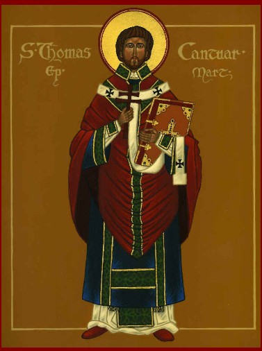
There should be room for unfamiliar and unconventional colors and combinations of colors even in very traditional settings. For example, while the idea may seem unorthodox to tradition-minded church people, red could also be used on Christmas. It is, in fact, one of the colors that is closely associated with Christmas in virtually every other context, including the decorations which adorn most churches during the season of the Nativity. Banks of red poinsettias are piled on and around altars. Red ribbons and bows festoon garlands of greenery. And the tiny red berries of the holly tree even have a religious significance, calling to mind the fire which was in, but did not consume the burning bush where Moses encountered God. The Blessed Virgin Mary, who bore God within her womb but was not consumed, is likened in Christian symbolism to the burning bush and holly is one of her symbols. So, why not vestments of red decorated with green for Christmas as in this icon of Saint Thomas of Canterbury, who was martyred on the fifth day of Christmas? Alternatively, since green is the other popular color for Christmas, why not use green vestments trimmed in red, remembering that the evergreens with which we deck the halls are meant to remind us of the everlasting life that is given to us by Mary's Son?
As the saints are each unique in their life and witness, it would be appropriate to revive the medieval practice of distinguishing them by the colors used on their feast days. A few especially noteworthy individuals might be distinguished by a color unique to that one saint. Traditionally, blue has been associated with the Blessed Virgin Mary in the West and some churches have blue vestments reserved for use on her feast days. Another color that would be singularly appropriate to the Mother of God is rose. Since the Middle Ages, the rose has been closely associated with Mary: the rose is the queen of flowers and Mary is the flower surpassing all others, the Queen of Heaven, the Mystical Rose.
The Latin word feria means a free day, one on which workers were released from work and were free to pursue private interests and activities. In other words, a feria was what we would call a holiday or a day off. When Christianity became the official religion of the state, a feria was a feast day, a holy day ("holiday") which the faithful would celebrate by attending mass. English fairs (feria is the Latin root of the word "fair") were held on such days and were important occasions in the life of many towns. Often, as, for example, at Glastonbury, these fairs were held in conjunction with a religious pilgrimage to a local shrine. In time, however, the meaning of the original word was turned upside down, at least in liturgical use. Ferias continued to be "free days" but instead of being feast days, they became days on which there was no feast, days on which the clergy were free of special liturgical obligations.
Technically, Saturdays and Sundays are never ferias. Only weekdays on which there is no feast are properly called ferias, so the Sundays are not ferias. Similarly, Sundays may never be fast days. So, just as the Sundays in the season before Easter are Sundays in Lent, not Sundays of Lent, so the non-festal Sundays after Epiphany and Pentecost may be regarded as being Sundays in ferial seasons, though the Sundays themselves are not ferias. Thus, the color appointed on those Sundays is the same color as that used on ferias during the week.
The modern Roman custom of referring to ferial seasons as "ordinary time" is misleading. The term derives from the word "ordinal", meaning "counted". The Sundays in ordinary time are counted: the First Sunday after Epiphany is, in the Roman calendar, the first Sunday in ordinary time. The Roman calendar does not distinguish the Sundays after Epiphany and the Sundays after Pentecost. Rather, it simply counts the Sundays of "ordinary time" and inserts them in order whenever there is an opening in the calendar, namely after the Epiphany and again after Pentecost. However, the word "ordinary" in normal English usage is more generally understood to signify something that is mundane, a meaning that can never be appropriate when referring to liturgical time. Liturgy always takes place in sacred time, time which is anything but mundane. Thus, we prefer the term "ferial" to refer to those seasons which are outside of the great cycles of the Incarnation and the Paschal mystery.

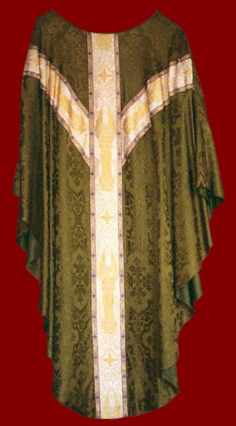
The color green has particular associations with the natural environment. It brings to mind the seasons of spring and summer. It suggests growth and health in nature. It is found in many shades and hues in the natural world and this is true in liturgical use, as well. It is mentioned only rarely in medieval English sources as a liturgical color, but in the familiar use of modern western churches it is the standard color for Sundays and weekdays which are not feast days in the seasons after Epiphany and after Pentecost. In these seasons, the themes found in the appointed readings at the Eucharist involve learning and growing in Christ in every day life. In Orthodox churches, green is the color for the Feast of Pentecost itself, when the whole church is traditionally decorated with natural greenery.
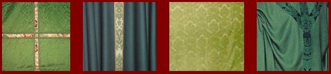
It is not unusual for a parish to own two, or more, sets of festal vestments--perhaps a gold set as well as a white set, not to mention the rarely used red set. But the same parish may own just one set of green vestments, in spite of the fact that it is the color that gets the most use, by far. Here is an area for a little extravagance or a little creativity, or both. Green comes in many shades (some which we like better than others, to be sure). One way of introducing some variation into the liturgy is simply to acquire an additional set or two of green vestments. One set might be used in Epiphanytide--perhaps a deep, warm shade of green for those months at the end of winter--and another set in summer, a lighter, more lively shade. Another idea would be to imitate our medieval forebears who were less dogmatic about color. As summer ripens, consider substituting yellow for green (assuming yellow has not been adopted as one of the festal colors of the parish). And, as summer gives way to autumn, yellow might give way to a deeper hue, perhaps an orange or rust. Tapestry fabrics offer another option. Orphreys are often made of tapestry but, if the material is not too heavy, it is also possible to make a vestment out of tapestry fabric. The point is to let the imagination work in the service of the liturgy.
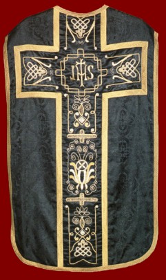

White is not one color, but the sum of all of the colors. Black is its antithesis, the complete absence of color. It is the absence of color and of light, total darkness. Technically, it is not a color at all. Thus, black appropriately signifies our sorrow and longing for what is gone, our sense of separation and loss. In our culture, black has always been the traditional color of death and mourning. In many traditional color sequences, black was the color of Lent, the season when we mourn our sins, as well as the color of Good Friday when we experience the extinguishing of the Light and the death of Life himself.
For many years, black was used at funerals and also on All Souls' Day, when we pray for all of the faithful departed. Later, black was replaced by a somewhat less mournful purple. Then the liturgical movement proposed shifting the emphasis at funerals away from death and focusing instead on the hope of the resurrection. Black was virtually banished from the altar and replaced with white. In retrospect, we wonder if that was a wise change in a culture which already does its best to deny the reality of death in so many ways. At many funerals, it seems that it is not the resurrection of Christ that is affirmed but the resurrection, indeed the canonization, of the recently deceased person. Christ is indeed risen, and that is our hope, pointing us toward the new life promised to all who are in Christ. But at the moment of death we need to acknowledge the reality of sorrow and loss, as well as the prospect of judgment. These things should not be covered over. The "sure and certain hope of the resurrection" is our consolation, but death is still real and should not be denied.
Having said that, black does signify darkness and sorrow, so its use at the Eucharist, which is always, by definition, a celebration, seems somewhat discordant. Thus, in practice, many black vestments are softened by rich decoration of gold or silver, or other colors which point to the hope beyond sorrow and loss. We know one parish that owns a funeral pall that is black with green orphreys, and another that owns a pall that is entirely green. Black, which expresses the reality of the darkness of death, together with the hopeful green of continuing growth seems to us a rather potent symbol of our faith, affirming that when we die "life is changed, not ended; and when our mortal body doth lie in death, there is prepared for us a dwelling place eternal in the heavens."